Purpose
The purpose of this article is to break down what’s involved in Moodboard process. To highlight the best practices and why they work.
Introduction
A Moodboard is a visual tool used in the pre-production stage of video production, animation, or other visual media projects. It consists of a series of drawings or illustrations, usually accompanied by a written description, that depicts the sequence of events or actions that will take place in the final product.
By creating a Moodboard , you can get a clear picture of how your project will look and feel before you start production, saving time and resources in the long run. Here are some best practices to keep in mind when creating an effective storyboard:
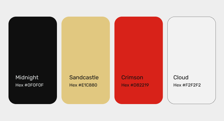
Color Palette
A color palette is a selection of colors used in a design, artwork, or brand identity. It’s a collection of colors that are chosen to work well together and to convey a certain mood or message. A color palette typically includes a primary color, one or more secondary colors, and sometimes accent colors.
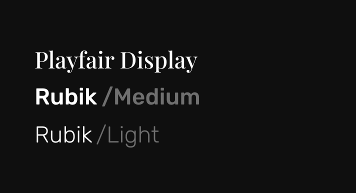
Typography
Typography is the art and technique of arranging typefaces, fonts, and text in a way that is visually appealing and effective for communication. It involves choosing the right typeface, font size, line spacing, and layout to create a clear and legible design.
- Typeface – A typeface is a set of characters with a consistent design and style.
- Font – A font is a specific size, weight, and style of a typeface.
- Line spacing – Line spacing refers to the distance between each line of text.
- Alignment – Alignment refers to how text is positioned on a page.
- Hierarchy – Hierarchy refers to the visual arrangement of different elements in a design to create a clear order of importance. Typography can be used to create hierarchy by using different font sizes, weights, and styles.
- Tracking and kerning – Tracking refers to the overall spacing between characters in a word or phrase, while kerning refers to the adjustment of spacing between specific pairs of characters to improve readability and visual balance.
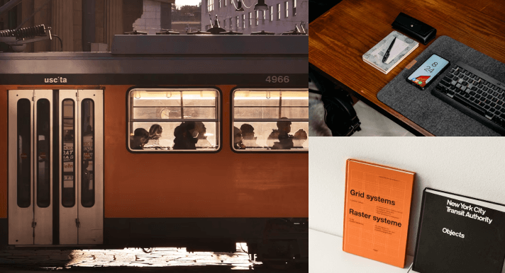
Photography/Socials
It involves using technical skills such as composition, lighting, and exposure to create visually appealing images. Photography can be used in a variety of settings, including fine art, commercial advertising, photojournalism, and personal documentation.
Creating a cohesive visual identity: High-quality photography can help create a strong visual identity for a brand, with images that reflect the brand’s values, personality, and style.
Photography can be used to tell a brand’s story, showcasing the people, products, and processes that make it unique. Social media platforms provide a way to share these stories with a wider audience, helping to build brand awareness and engagement.
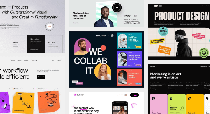
UI Layout
UI layout refers to the way that user interface elements are arranged on a screen or page. A well-designed UI layout should be intuitive, easy to use, and visually appealing.
- Consistency – Consistency in UI layout means using the same design elements and patterns throughout the interface. This includes using the same fonts, colors, icons, and layout across all pages and screens to create a cohesive user experience.
- Hierarchy – UI layout should use visual cues to guide users through the content, with more important information displayed more prominently. This can be achieved through the use of color, size, placement, and other design elements.
- White space – White space, or negative space, is the empty space between UI elements. Using white space effectively can help create a clean, uncluttered design that is easier for users to navigate.
- Grids – This can help create a sense of order and balance in the design.
- Flexibility – UI layout should be flexible enough to accommodate different screen sizes and resolutions, as well as different user needs and preferences.
- Accessibility – UI layout should be designed with accessibility in mind, with consideration given to users with different abilities and needs.
Graphic Vector Elements
Unlike raster graphics, which are made up of pixels, vector graphics are created using mathematical equations that define shapes, lines, curves, and colors. Because vector graphics are created using mathematical equations, they can be scaled up or down without losing quality or resolution.
- Icons: Icons are simple vector graphics that represent a specific object or concept. They are commonly used in user interfaces, websites, and print materials.
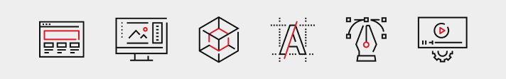
- Illustrations: Illustrations are more complex vector graphics that depict scenes or characters. They are commonly used in advertising, book covers, and editorial designs.

- Patterns: Patterns are repeating vector graphics that can be used to create backgrounds, textures, or decorative elements. They are commonly used in textiles, packaging, and web design.
- Infographics: Infographics are vector graphics that combine text, icons, and illustrations to visually communicate information or data. They are commonly used in presentations, reports, and social media.
Textures
Textures are visual patterns that can be added to designs, images, or graphics to create a tactile or three-dimensional effect. Textures can be used to add visual interest and depth to designs, and can be applied to a wide range of surfaces, such as paper, fabric, metal, wood, and more.
Here are some common types of textures:
- Grunge
- Wood
- Metal
- Paper
- Fabric
- Concrete

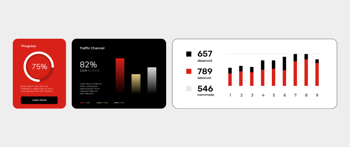
Demographics
In marketing and advertising, demographics refer to the characteristics of a specific group of people, such as age, gender, income, education level, occupation, marital status, and geographic location. Demographics are used to understand the preferences, behavior, and purchasing habits of different segments of the population, and are an important factor in developing targeted marketing campaigns.

Logo Pegs
Specifically for Logo Studies type. As much as possible try to be specific and group the existing Logo images into categories.
You can divide the logo concepts into 5 different types:
- Wordmark
- Emblem
- Pictorial Mark
- Abstract
- Mascot

The Goal
The goal is to provide the designers with a visual direction beforehand. Cutting the cost of research and assets gathering. And that’s why it’s important to link the resources so that the designers can dive deep into the design direction. Remember we collate resources and inspirations and cut the time for an efficient turnaround time.
Best Practices Dos
- Use The Mxie Template
- Always link your sources using this
- Approved Stylescapes must be included on Projects such as Logo
- Studies
- As much as possible maximize Keywords
- Keywords are almost always adjectives
- Share the Following:
- Brand Attributes Docs
- Box Links
- Storyboards Docs
- Docs Moodboards
- Sitemap Sheets
- Monday Links
Best Practices Don’ts
Do not Link any internal Docs. Keep in mind that we utilize the Pre Prod sandbox for internal and client presentation
- Do not add vulgar comments
- Avoid adding memes – Moodboards should be presentable in case the client wants to see.
- Don’t use too much color on Notes on Figma
- Do not tilt pegs and resources on Figma. As much as possible.
- Avoid Vague descriptions. Sentences are much appreciated
Figma Jam
FigJam is an online collaboration tool you and your team can use to brainstorm, develop, and organize ideas. You don’t need to have any prior knowledge of design tools to get jamming. FigJam files are lightweight, inclusive environments where anyone can take part.
Templates
Here are some templates the Fix team utilizes:

The Moxie Template Docs Link make a duplicate

The Moxie Collection Figma FIle